Improving the readability of content cards
🔥 Campfire 31: Content cards are a popular way to organize content in app design. Cards allow users to browse high-level information while consuming samples before clicking on the card to get the full details.

Using cards alone will not result in a fantastic browsing experience. You must also optimize their readability.
Optimal readability is more than whether or not users can read the text and make out the words. It also indicates whether they can scan and process text efficiently.
Cards can be hard to scan when different text types on the card conflict for attention. As a result, users cannot differentiate the most essential information from the secondary and usually get lost.
If you ever found yourself moving your eyes back and forth around the card — you've experienced difficulties processing information. All because the card had a wrong readability structure.
To fix this, as designers, we can add the appropriate amount of visual emphasis to elements on the card.
Typographic hierarchy of the card
A card usually has a few text types that serve different info functions.
There are:
An eyebrow — a categorical word or phrase that describes the content's subject
Heading that tells the user what the content is about in a few words
Metadata that provides relevant context about the card
Body text that describes the content in a short paragraph
To figure out which text types are more important to users, you must establish the typographical hierarchy of your card.
In our case, the proper typographical hierarchy of the card would be:
Heading — The most important because it describes the content the quickest way
Eyebrow — provides additional context on the content subject matter
Metadata — Provides general context about the content for users to gauge its relevance
Body — Contains a descriptive paragraph but takes the most time to read
Users should be directed to scan the text types in this order on your card. You can use visual design techniques to apply proper visual emphasis to the text types.
Controlling the order of what users see
You can control the order of what users scan and dictate a scanning pattern that mirrors your typographical hierarchy with a proper visual emphasis.
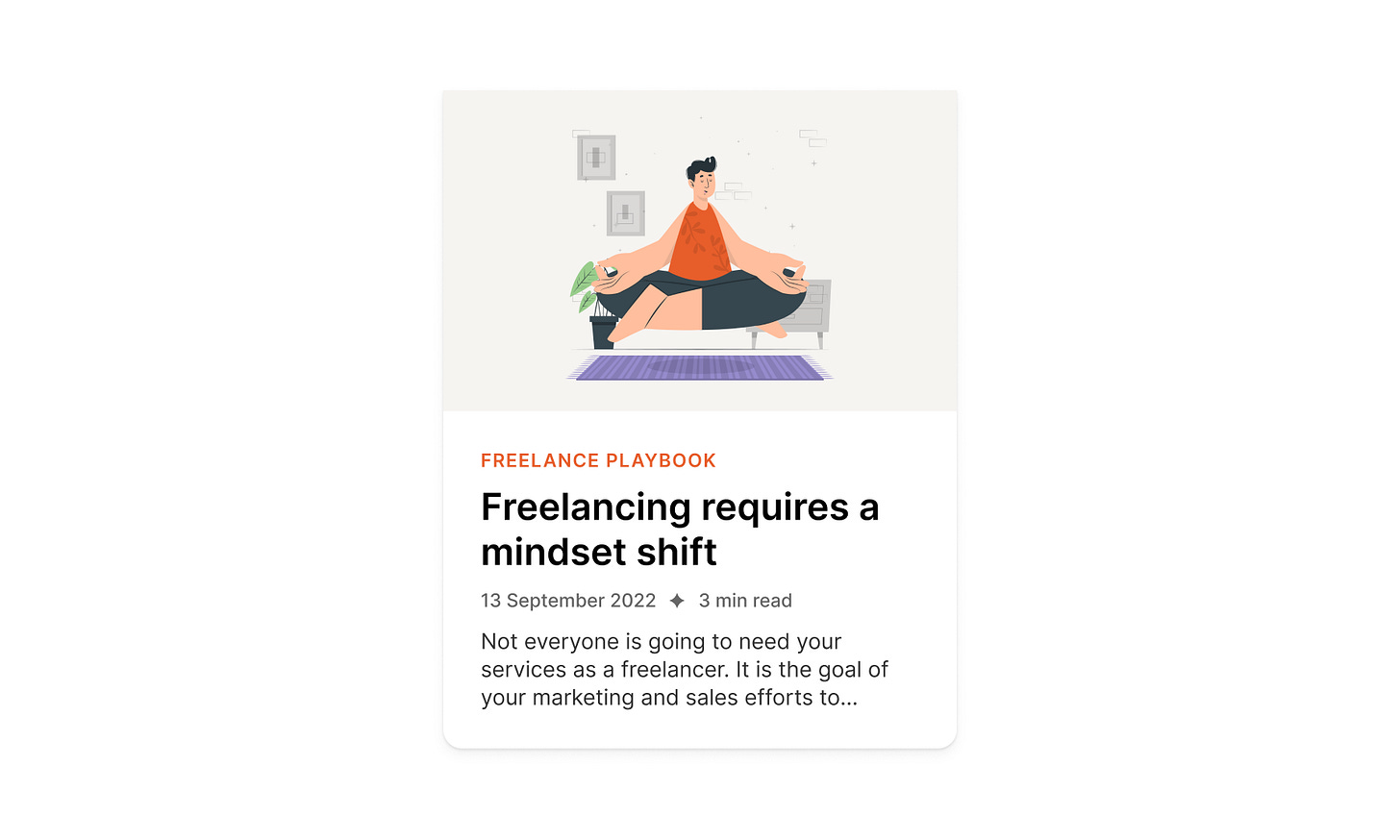
The example below illustrates a comparison of how to scan control works. The difference is the emphasis on different text types.
When visual hierarchy is applied, the heading is emphasized to a greater degree. The eyebrow and metadata are emphasized over the body. The result is an efficient scanning pattern that mirrors the typographical hierarchy.
Optimizing for readability is even more beneficial when multiple cards are on the screen. Optimized cards allow users to scan the anchors without visual interference from the surrounding text. Uncontrolled cards are harder to scan because the surrounding text types cause optical interference.
Ways to improve the readability of cards using visual hierarchy
These are some of the visual design techniques you can use to improve the readability of your cards. You can mix and match them to achieve the appropriate result.
Text scale
Larger text is always easier to scan than smaller text.
This is why you must scale your headings more than other card text. Your goal is to get users to start their reading from the header.
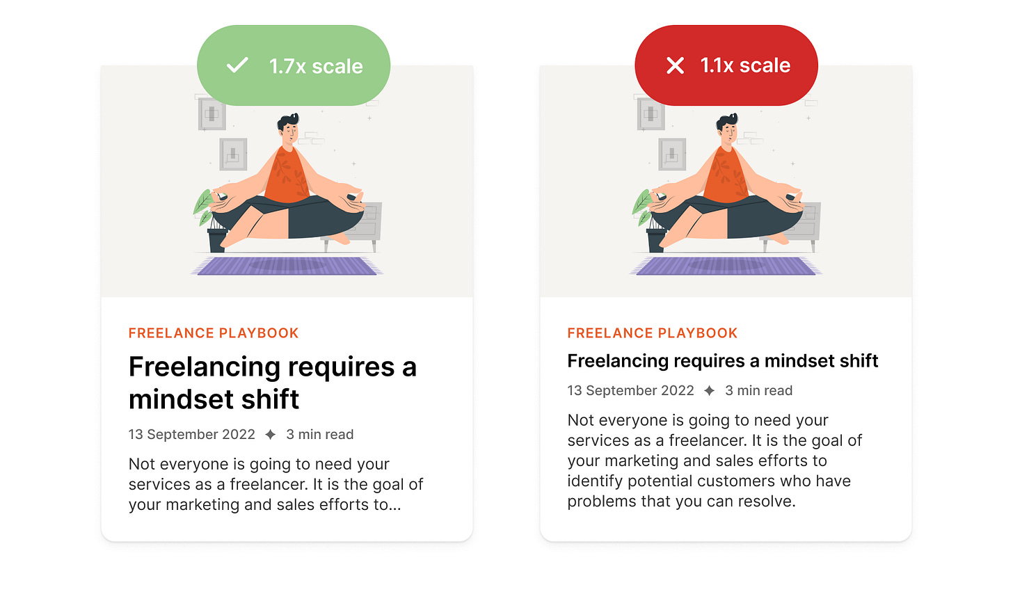
It's a good practice to use a 1.4-1.8 scale between the paragraph text and heading sizes. Let's look at the example here:
As you can tell, the title on the card on the left is much more prominent and easier to read at a glance.
You can also scale the text down to de-emphasize it, but there's an accessibility limit you can scale down to. If you make it too small, it will be hard to read. This is where color contrast comes in handy.
Color contrast
Lower color contrast helps create a visual hierarchy when you have already hit the scaling limit. But just like scaling, there's a limit to how low your contrast can go. If you make it too light, people will hardly be able to read it.
Note: there's a general rule of all accessibility guidelines — don't use color alone to create a visual hierarchy. Because many people have color blindness, they might not notice the color difference.
To create a proper visual hierarchy using color contrast, start with the darkest color for the most essential elements (in our scenario, it's a heading) and lower the contrast for less important elements, such as an eyebrow, metadata, and paragraph text.
Letter case
I'm sure you noticed that our eyebrow is in all caps and a different color than the rest of the text. That's because we want to bring users' attention to it right after the title to give them the proper context of the subject matter.
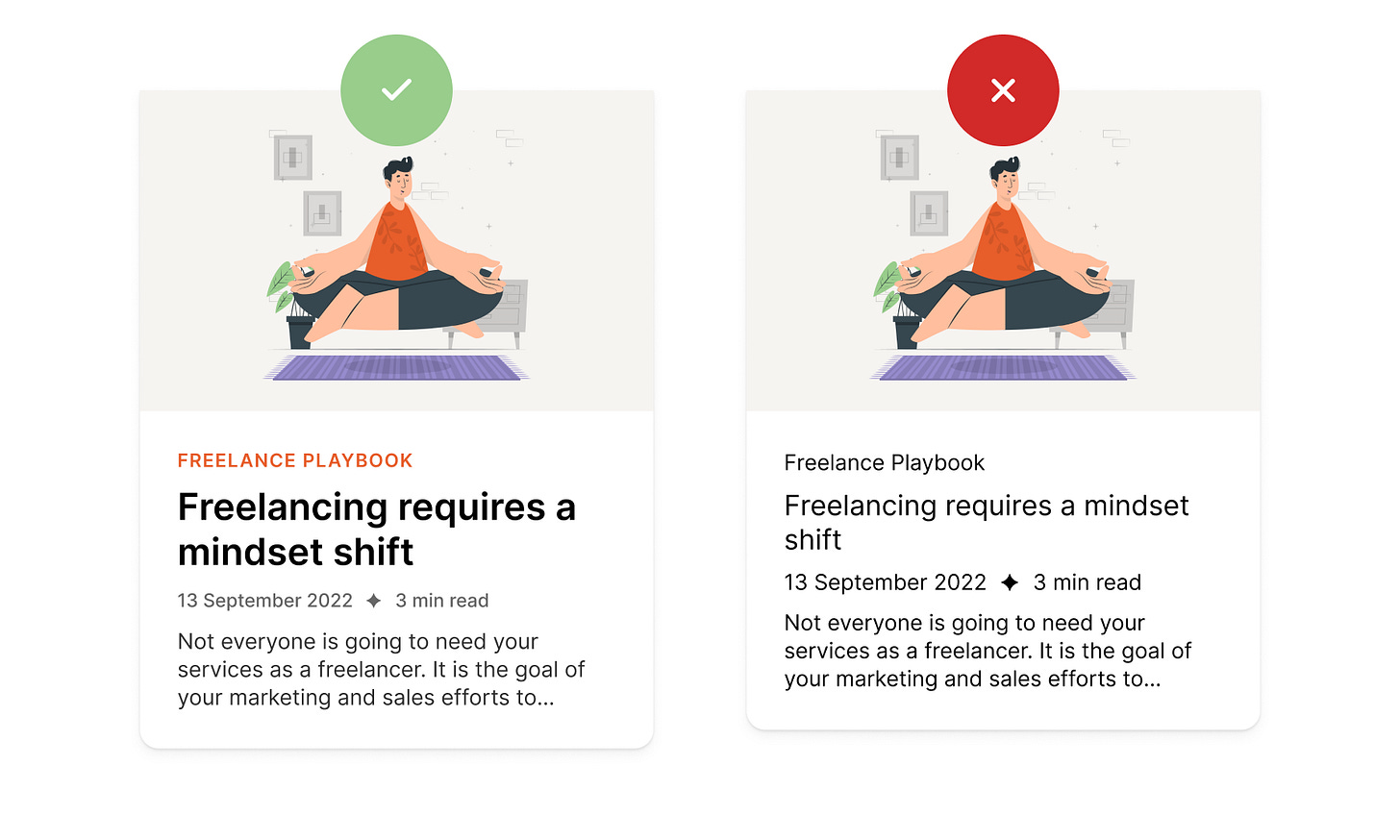
We could use the title case and gray color for the eyebrow, but then the hierarchy between the eyebrow and metadata is less visible.
All caps casing makes the letters appear bigger. When using it, reduce the font size, so it doesn't dominate other text.
A rule of thumb is to only use all caps cases for short phrases in small components. To make it more readable, consider adding a slight letter spacing.
Font weight
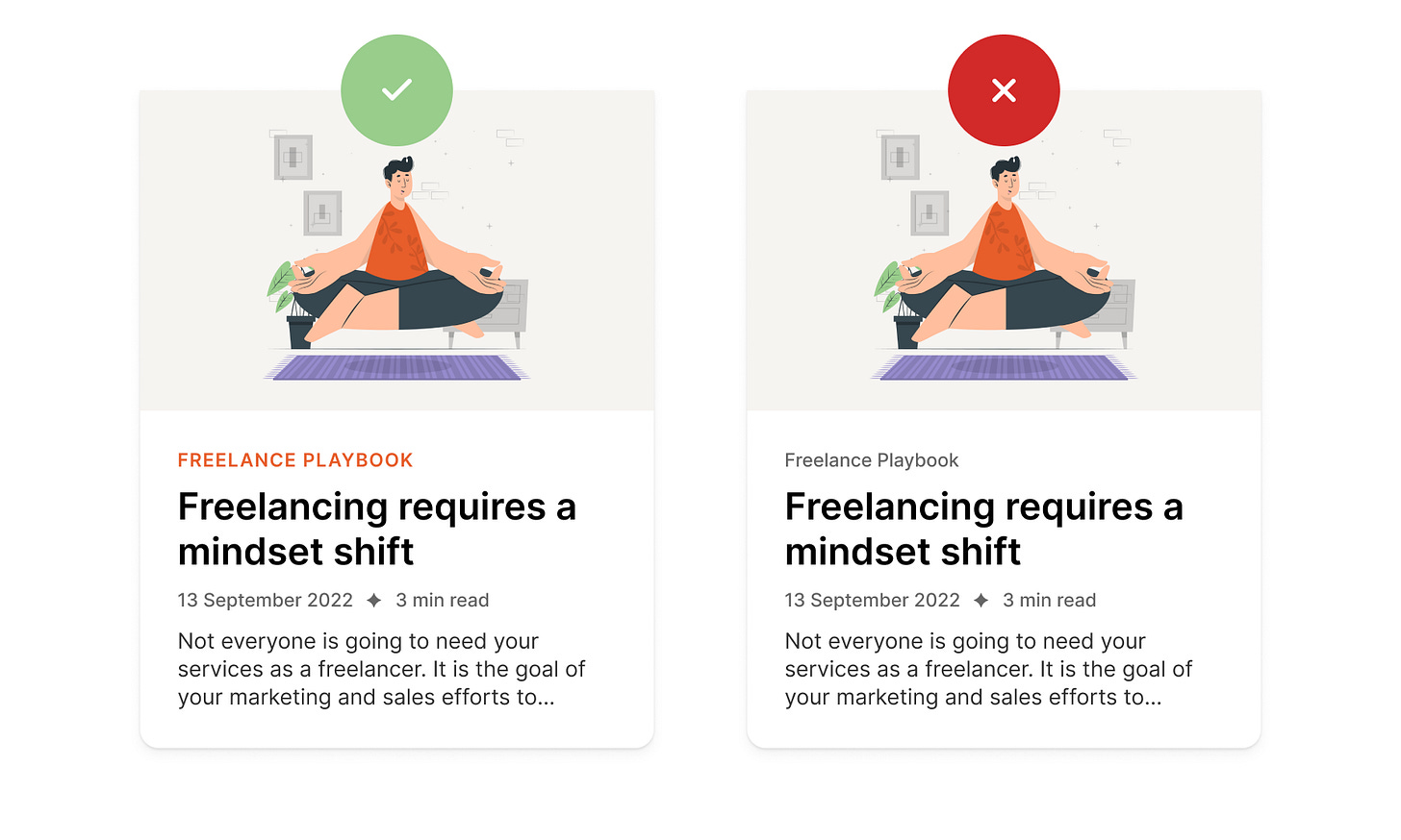
Scaling the text and color contrast sometimes are not enough to give an element more emphasis. This is where the font-weight can help. It adds an extra layer of emphasis that makes the appearance finer.
The heading and eyebrow are heavier in font-weight than other text on the card. This adds visual emphasis and makes their position in the visual hierarchy stronger.
Use bolder text for headings, medium weight for the eyebrow, and regular weight for the rest of the text. Make sure you use the font that offers a variety of weights you can choose from. In this example, I'm using Inter, which is free.
Typographical hierarchy defines the design
Typographical hierarchy helps user scan and process information faster. It also allows the designers to guide the users to the most essential areas of the card.
Once you figure out your visual hierarchy, you'll be able to create stunning content cards that provide your users with the most critical information and are easier to scan.


