
Design as a business tool
Design is one of the most underrated business tools. It can bring your product greatness and boost your sales, or it can make the best business strategy flop.


Design is one of the most underrated business tools. It can bring your product greatness and boost your sales, or it can make the best business strategy flop.
Today we gonna uncover why design is vital for driving sales and some top-notch design tips that will help you grow your business.
Put simply, the human brain has two parts: logical and emotional. To sell a product, your goal is to push the right buttons in the customer's emotional brain. This is where design can be used.
30,000 years ago, humans started creating their first visual stories. We started drawing before we could write. Since then, our mediums have changed, yet visuals remain the center of attention. But why?
The answer is simple – visuals own the fast line to the brain. 90% of the information processed by the brain is visual. And it takes 13 milliseconds for the brain to process an image.
This is why design can effortlessly access your customer's emotional brain.
Combined with a strong narrative, design solicits higher engagement with our emotionally-centered brain. But the impact of design goes beyond the design itself. It can't move these levers on its own. If we're talking about the business value of design, we need to include all areas of the business in these initiatives.
Why is design important for business?
When presenting a product, it’s essential to talk about numbers beside the aesthetically pleasing designs. However, while numbers are crucial, they need context. Placing the numbers (content) in the proper context is smart. It’s a good design.
The visual aspect of business has grown 100x in the past years. But according to InVision’s report, only 5% of the companies surveyed are reaping the most incredible design benefits.
Design can be your business’ best friend. It has the power to draw attention to your brand, raise brand awareness, and increase brand exposure. It can prompt people to make purchase decisions, raise brand credibility and authority, and differentiate your brand from competitors.
According to an Adobe State of Create report, almost half of respondents pay more for a product or service with good design, and 59 percent say they would be more loyal to a good design brand.
But how can you use design to grow your business?
Design tips that will help your business
Here are 5 ways you can use design to boost your business growth.
Use design to evoke emotion
While embracing modernity, you should remember tradition. No matter what’s trendy at the moment, you can’t escape human psychology. Some design elements will never lose their impact on customers.
When creating designs, you must consider the elements you include in your project and approach their selection strategically. Colors, fonts, and spacing of elements play a significant role in driving purchase decisions. It’s the power of the subconscious.
For example, the red color can grab your audience’s attention and prompt them to take action. It’s the color of passion, love, and excitement. It’s a great design choice for when you need to motivate your audience and direct them towards doing something.
Prevent choice paralysis
"Choice paralysis" is a marketing term that refers to the inability to make a decision. When a user is presented with too many options, choice paralysis occurs. The choice is excellent, but if your customers are given too many options, they may become confused about which direction to take. Nobody wants buyer's remorse (when a person buys something and later realizes it isn't right for them), so many people spend more time on decision-making than they should: they become paralyzed.
In fact, when customers have too many options to choose from, they avoid a particular service or product in general (Paradox of Choice), which is precisely what we as designers must keep in mind when creating our designs.
Make it easier for people to find the right product or service to avoid choice paralysis. Tell them what each option is good for, and then recommend which one they should pick. If the product isn't right for them, they'll choose something else, but a "default" option can help them avoid decision paralysis if they're undecided. You can even use visuals to draw attention to your most popular product and direct potential customers to it.
Guide attention
Your visitors must be guided through your content. This can be accomplished by aligning items in a logical order and using eye-guiding images. Use a large arrow, for example, to draw attention to something. The arrow will catch people's attention, and we naturally want to see where it points.
Organize your content in a way that leads to a specific goal. Having a fair number of feature descriptions can be confusing and lead to visitors getting lost unless all of the points end in calls to action.
If you want to ensure your visitors don't miss anything, arrange everything in a linear pattern that the user can scan through. Ensure you finish with the most important call to action: the signup or download link.
Always provide next actions
If you're creating a website to sell something, whether a software application or a web service, you should consider how you'll close the sale on each page. This does not imply that every page should have a large "Buy now" button. Instead, when a customer is ready to purchase, they should not have to search for the check-out link.
Always include next-action links to keep the flow going and avoid losing potential customers' attention. The visitor can be directed to a page with more information about the product or to the actual page where they can make a purchase or sign up using next-action links. "Ready to order? Click here," "Learn more," "Take the tour," or "Shop now" are examples of these links.
Never leave a page with a dead-end: always tell your visitors where they should go next.
Utilize the reading gravity
In the Western world, reading gravity refers to the practice of reading from left to right, top to bottom. The diagram divides a page into four quadrants: the top left "Primary Optical Area," the top right "Strong Fallow Area," the bottom left "Weak Fallow Area," and the bottom right "Terminal Area."
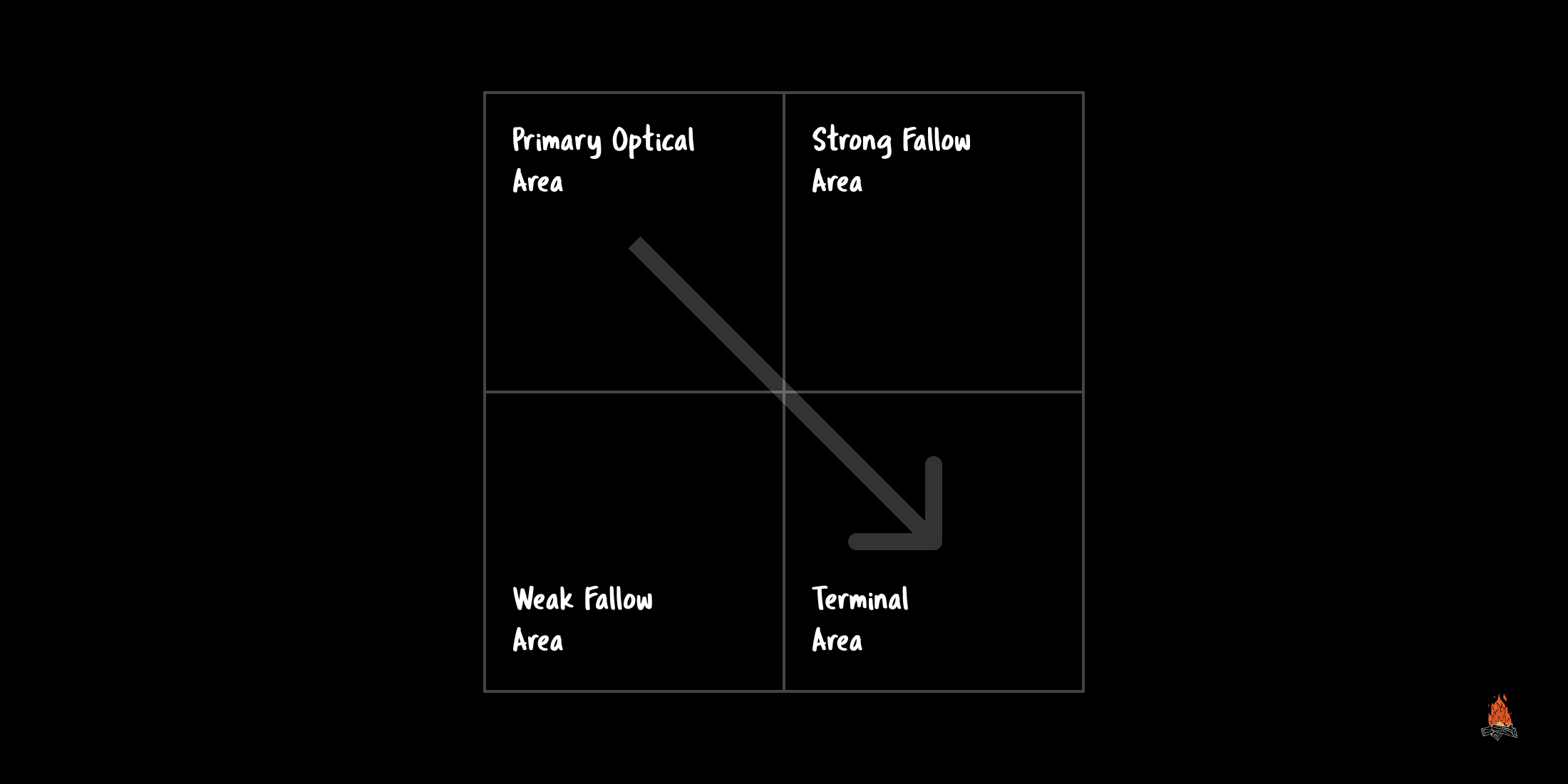
It suggests that the bottom left area of the page will get the least attention as our eyes scan the page from the top left to the bottom right and that our glance would end up in the lower right portion of the page.
How can we utilize this concept? Buttons and calls to action could be placed in the bottom right instead of the bottom left, as this is where the visitor's glance is likely to descend.
Final thoughts
Design is one of the most incredible tools in the business toolkit. Companies that use it wisely reap all the benefits.
Use the tips in this article to boost your business revenue and drive sales.